ADVOCATE REBRAND
Brand Development
Advocate Insiders, an IT consulting company specializing in helping organizations transform and optimize their cloud, connectivity and unified communications infrastructure, rebranded themselves in 2013. Formerly known as Advocate Consulting, they worked with our strategic partner, PitchMaps™ to re-define their overall business voice and messaging. The result was a new name, Advocate Insiders and a new tagline, “The Cloud and Connectivity Insiders.”
On recommendation from PitchMaps™, they turned to us to create a logo and brand identity package, complete with business cards, letterhead and brand standards guidelines.
Upon delivery of the initial project, the Advocate Insider team was so happy with the results, they expanded their partnership with Atomic Wash, and tapped our team to develop their new website, sales collateral materials and annual conference literature.
Services
- Over All Brand
- Brand Content Strategy
- Logo & Identity
- Critical Communications
- Website
- UI/UX
- Web Content Strategy
- Content Strategy
- Presentation
- Marketing
- Tradeshow
- Advertising
- Environmental Design

Logo Design
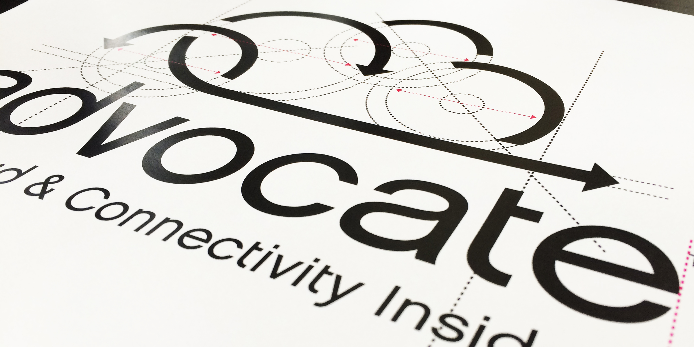
Our task was to adapt and blend the new name, tagline, voice and messaging into a strong, meaningful logo and branded look. We started very conventionally with a ‘brainstorming’ session complete with pencil and paper to ensure our ideas truly worked before we touched the computers. Our goal was to create a logo that was Disruptive, Engaging, Meaningful, Memorable, and Authentic. After a few rounds of logos, we arrived on a final direction. The new logo projects a strong. highly visual concept of Advocate’s field of expertise and serves as the foundation of the brand.


Website Content & Design
After our success with their logo, Advocate asked to us handle designing a new website to further support their new brand. As a cloud and connectivity provider, it was key to begin by examining the required content before building out appropriate graphics. As usual, we started with a vision to simplify everything. We cut about 50% of the copy we were given by culling down to the essential information and then wrapping it in a clear narrative style. In addition, we incorporated a great deal of the messaging from their PitchMap™, expanding on it where necessary to ensure the content was relevant and substantial to the visitor. Then we introduced case studies and sales tools throughout the site along with powerful calls to action. With that base, we designed a strong graphic story around the content using clean, modern visuals. The result is a very strong, effective and responsive website for Advocate that works across all platforms. The site is complete with a CMS system that enables easy updating and ties to their sales infrastructure and content marketing. Since launching, Advocate has experienced 3x more traffic than their original site and engagement time has gone up by 65%.


